Linggo, Setyembre 11, 2011

Motorola Xoom


The Motorola Xoom is the competitor of Apple's Ipad. Motorola Xoom used the concept of using several persons of the same appearance and same actions. Among these kind of persons, there is one that is different and unique. He is the one owning the Motorola Xoom. These persons live in a boring and monotonous world. Their way of life is limited and seem to be controlled. 

They used the guy owning the Xoom in the commercial which is unique among them because they wanted to tell us that their product i like no other. Theirs is unique. They are not boring nor limited. 

The man in the ad also did several things that most of the people who wore white cloaks did not do. He liked a woman and wanted to give her flowers and wanted to show his admiration but instead of giving it to her personally, he found a new way to give it to her, he use the Xoom to give the flowers and to show his affection. The guy did not use the traditional way of courting the woman. He was extra-ordinary. The girl in the ad responded which brought change to her.

The man represented the Xoom giving color to life and making it better. Xoom brought change. It showed freedom, uniqueness, and empowerment. The other persons wearing white cloaks represented the persons who are using a different brand which had boring and limited services.

They wanted to tell that Xoom is different. It will bring change, color, and betterment. People must not live in a world wherein technology is limited. If you use Xoom you will be different and better among the others.

The ad used the emotional and information appeal. It touched the emotional side of a person. They used the admiration and courtship. With it, they partnered the product benefits. 

Anti-smoking ad campaign


Both of these pictures have different images but have one message. It wanted to tell us, especially the women who smoke that smoking does not make you pretty. 

A lot of ladies think that smoking makes you "in" and that it would make you "belong".  This is a perception that smoking adds class, glamour, and beauty which is wrong. It makes you unhealthy and for sure, it's not pretty. Smoking destroys your health, your glow, and your beauty.

The first picture, shows a woman using a cigarette as her lipstick. This is a symbolism of the perception of women that cigarette or smoking is really used by women as a tool for enhancing beauty. It only made the woman's lips ugly. It burned her lips. It suggested that smoking is unhealthy. The second picture depicted the same thing. The lips of a woman were destroyed and burnt.

Smoking does not make you pretty, if that's what most girls think. It makes you ill and when you become sick, it would surely destroy your beauty.

Both of the pictures inflict irony and fear. They used the fear appeal because it would be more effective for campaigning the stop of smoking. People who would see this would understand and would easily absorb the message of the ad. 

Air New Zealand Commercial


The Air New Zealand staff have nothing to hide. "Bare essentials of safety.", This theme wanted to suggest that the safety of their passengers are ensured.  As you avail their service, you will be informed with all the safety measures and all the necessary procedures to guarantee a safe, stress-free, and enjoyable flight. You will never be ignored nor be misled. Their staff will keep you guided, aware, and secure. They will give you an a detailed, clear, and useful on-board safety demonstration.

In the commercial, the staff are undressed and they only used body paint to cover their skin. Their body paint was based on their usual uniform. They associated it with their theme, "bare essentials of safety." Their staff are naked and they have nothing to hide. They wanted to relate it with their service of providing their passengers all the necessary information. They have nothing to hide. They are confident with their service and with the safety that they provide so they will tell and share to you everything.

They used humor appeal in their commercial. As you will watch it, your attention will be easily caught. You will laugh or you will smile. Perhaps, they used this appeal because they wanted to make their passengers or probable consumers feel light. They do not want to inflict fear or worry because they advocate and sell the safety of their passengers. 

You may also notice in the commercial that the staff of the airlines are friendly, hospitable, and accommodating. They do not only ensure safety but as well as good service brought to them by the staff of the airlines. The passengers were also amazed of them. In the commercial, the staff caught the attention of the passengers because of their appearance but in real life,  they wanted to convey that they are liked because of the way that they handle their consumers.

Their song, "I've got you under my skin", is also very light to hear. It will make you feel comfortable.The message of the song that they used is also related to their theme. 

They wanted to make you feel that what you pay for is all worth it. You will get the service that you deserve. They will give you everything and they won't hide anything from you.

Linggo, Agosto 14, 2011

Pantene TV Ad


Pantene used four of the most glamorous and beautiful celebrities in the Philippines as their endorsers. They are Gretchen Barreto, Dawn Zulueta, Angel Aquino, and Ruffa Gutierrez. 

They used celebrities which are physically attractive. These are celebrities which are popular and liked. This celebrities would easily catch the attention of the consumers. These models were chosen because Pantene felt that they would be believable and their traits or image would maximize their message influence.

The clothes and even the background are white. White symbolizes purity. It suggests that their statements are true and pure. White is also used by gods and goddesses. The beauty of these celebrities are considered goddess-like.

In the commercial, these models are talking about a shampoo, the benefits of it, and the experience they got from it.  They tell us that they shine and stand out because of using this. In the later part, they confessed that all of them are using the same shampoo, Pantene. 

The ad ended with the lines, " What do these women have in common? They all love Pantene. Believe you can shine." The ad wanted to say that you will feel and look beautiful like them if you use Pantene. You can shine and standout among others with Pantene.

Nestle Cream TV Ad


The TV ad of Nestle Cream was very minimalist. It used no dialogues or speaking lines. In the first and the middle part of the commercial, there were only visuals and scenes accompanied by instrumentals. It was only in the last part that they used text, "Dapat Nestle Cream ang ginamit mo."

The ad used fear and humor appeal. Everything was based on real life situation, A lady visiting a relative at the cemetery and offering a salad. She returned home and found out the salad that she gave was back at her home.  It implies that Nestle Cream is the most liked cream that even the dead preferred it. There would be no cream like Nestle Cream. 

In the ad, you can't actually distinguish what product would they be endorsing. It was only in the last part that you would realize that it was a cream. Their target market was not even clearly stated.  This kind of ad might be confusing to others. The message might not be easily understood.

Perhaps, their purpose are to attract and entertain their consumers and to make their brand remembered.. There were no facts or information about the product. This would have two effects, Consumers will research more about the product or they would not mind it at all.

Their choice of putting the product at last part of the ad was effective. It enables consumers to remember their brand. 


Makulay ang Buhay TV ad


This TV commercial is for a seasoning mix. Their message were conveyed through a song. The song tells us that children do not like to eat vegetables but when the seasoning mix was used in cooking vegetables, children favored this. Their song was also happy and jolly. It also included dancing. They used this so their ad would be easily retained in the mind of the consumers. The lines of the song also invites moms to use Knorr in cooking vegetables and other kids to eat vegetables seasoned with Knorr.

Their subjects or endorsers were kids and a mother. They used this because their target market are children and kids. Children do not want to eat vegetables and mothers always find it hard to search for  ways to let them ear these. They want to tell mothers that Knorr can solve their problems in feeding  their kids vegetables.

In the first part of the ad, everything was black and white. It was this time that kids did not eat vegetables. Life was dull. Kids were  not that active, happy, and energetic. In the later part, Knorr was in introduced in cooking vegetables. By this time, they used colors, backgrounds, and font styles which are playful and attractive for kids. Images of vegetables were also used as playing tools and equipment. The set was displayed as very creative and colorful so it would fit their theme, "Makulay ang Buhay sa Sinabawang Gulay." Colorful designs in the ad suggest happiness. Kids and the mom in the ad were also wearing clothes in yellow and red, colors of Knorr.

Besides from children dancing and singing, they also featured the kids playing and doing well at school. They wanted to imply that Vegetables with Knorr can increase their performance in school and their energy in playing. It makes them healthy and active.  

This ad was also constantly repeated at night. They preferred this because this is the only time that kids and moms can view the commercial. Kids spend most of their time in school or at play and this is the only time that they would be free to watch this. Moms, on the other hand, are busy at work during the day and it's only at night time that they can watch this with their children.

Lunes, Hulyo 25, 2011

Kitkat Bench


Kitkat came up with a creative ad. They did not use billboards, posters, flyers, and alike. Instead, they used a bench as a means for them to advertise their product. This idea is very effective that it need not for words nor descriptions about the product.

The bench was designed to look like the product itself, Kitkat. The packaging and the chocolate of Kitkat was totally copied. It's very effective because everyone can see it and use it. Even if persons were just passing by, surely they won't be missing this spot.

It would entice probable consumers. This would also serve as a constant reminder for people to buy Kitkat.

Summer time is Pepsi time


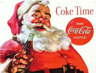
Whenever its Christmas and we see images of Santa Claus, we remember Coke. They have started using Santa as part of their promotions and commercials since 1930's. Coke helped us create the modern image of Santa Claus, the jolly and white bearded old man wearing a red suit. It has already become an identity and an association for the past decades.


However, Pepsi created an advertisement just this summer of 2011. A TV ad which directly targeted Coke. They used a direct comparison between them and Coke. They used Santa Claus as their subject. They emphasized on "Summer time is Pepsi time."

It's summer, Santa was enjoying and dancing on the beach. He was approaching the bartender to ask for soda. Without any word, the bartender gave him Coke which Santa refused because he wanted Pepsi instead. Of course the bartender was surprised because he is already known for partnering and dealing with Coke. But he said that it's summer and it's vacation time so it's just gotta be Pepsi.

Pepsi was trying to imply that Santa advertising Coke was just part of his work during Christmas. It's just like it only served as a front. His real choice was really Pepsi and not Coke.

After receiving Pepsi, Santa's elves uttered the lines, "naughty" and "nice". Naughty because he was not being loyal to Coke and he asked the bartender to keep quiet. Nice because he shifted to Pepsi, his real choice.

This ad will give a great impact to Coke. Since Coke only used Santa during Christmas season, Pepsi found its way to compete with Coke during summer. They used the strengths of Coke as their new idea and concept in developing an advertisement.

Linggo, Hulyo 24, 2011

McDo 1st Love TV Commercial


McDo's First Love Commercial  is about a man who was sharing his love story with his childhood friend that he met at McDonald's. He emphasized on the first part of the commercial that whenever he comes back at McDo, he remembers the first time she met her. They had an instant connection and he felt that she knew her for a long time already. They had the same favorite food, French fries with Ice cream sundae.

In the later part of the commercial they met again as adults at McDo. The guy was happy to see his childhood friend but he was disappointed to know that the girl already had a husband and a child.

They sat  and ate together, the usual thing that they did when they were still kids. The only difference now is that they were with the family of the girl. The girl was amused that he still liked to eat their favorite food, sundae with fries. It was just like bringing back the moments. The guy still felt the same for the girl. Even if it wasn't them at the end, he still considers the girl his first love.

The first setting of the commercial was around 1980's at McDonald's. They were precise with the clothes and hairstyle of the cast. The packaging of the food was also fitted to that of 1980's. McDo was also set including the chairs, tables, and all other elements so it would like it was in 80's.

The cast of the commercial was also put into consideration. Even if the characters grew and changed, they still had similarities in the way they dress and look so that  they would still be easily distinguished.

The song used in the ad was Huling El Bimbo by Eraserheads.It was appropriate for the commercial. The song narrated and told their story.

This commercial was not just endorsing their products, it also told the story of two childhood friends. It also tells us that McDo has always been a part of their lives from childhood until they had fully grown and had their own family.

The ad ended with the line, "Siya pa rin ang first love ko." It did not only mean the girl. He also considered the the ice cream sundae and fries of McDo and McDo itself as his first love.

Axe Print Ads


Axe has been very popular when it comes to their print and TV ads. The themes of their ads always  showcase the irresistibility of men who use Axe on women.


Most of their ads feature half naked men and women making love, women chasing and craving for a man's attention, couples doing the naughtiest things, and alike.

Their ads show the craziest things a woman does to get the man who uses Axe. They call this the "Axe Effect", the attraction or arousal of women on men who use Axe.


This print ad of Axe above shows two women who are digging up a grave of a dead man who used Axe when he was still alive. They used this to imply the strong  irresistibility and the long lasting scent of Axe.


 These print ads above showing a nun clipping her nose and women who line up to confess to a priest who uses Axe are just few of the craziest concepts that Axe thought about to attract their audience.


The nun clipped her nose because she does not want to be tempted to the Axe guys and she wanted to avoid sin.


The other picture on the other hand are women lining up to the confession box. Their purpose is not really to confess but to get near to the priest whom they are attracted to.

These are concepts which can be easily retained in the mind of the consumers. This idea is used by Axe to show us that the Axe effect has no exceptions. Anyone can fall for an Axe guy and an Axe guy can be anyone who uses Axe.


The print ads which I presented are not those that Axe usually features, it is conservative but still have the same impact.

Axe also wanted to tell the guys out there that using Axe can increase your manhood and your confidence on women. Some of Axe slogans are 'simply irresistible" and insanely irresistible".


Sabado, Hulyo 23, 2011

Coke Commercial Kasama Ka


Coke? Open Happiness.

Coke has always been giving us the impression that when you open a bottle of Coke, happiness comes in. Coke has been there with us in every occasion, event, and many other special moments. And now, Coke wants to be a part of our lives by giving us happiness.

This TV commercial  used a theme song with the title, Kasama Ka, which was sung by Nikki Gil.

Coke used this strategy because a message delivered in a song can be easily remembered. In fact, after the commercial was aired, it has become very popular to many especially to kids who kept on repeatedly singing the song.

In the song, Coke tells us that they want to be a part of our lives. They want to bring us happiness and smiles everyday. They wish that wherever life may bring us, they would always be there to give us love, hope, and happiness.

In the commercial, Nikki Gil was wearing a shirt in red, the color that defines Coke. She was  roaming around and giving a bottle of Coke to every person she passed by. Persons who received the coke smiled and had this happiness and glow in their faces.

The setting of the commercial was in the market and in the streets where every one is busy, preoccupied, and in a hurry. It is where you can see different kinds of people in different situations. It is a place where everything is fast paced and you can seldom see happiness.

They featured different persons such as an employee going to work, an old religious lady, a couple fighting, men carrying a load, a student in a hurry, and a flower vendor.

They wanted to tell us that Coke always give a space for happiness to enter even in these kinds of places and these kinds of people.

As you may notice, Nikki kept on getting unlimited bottles of Coke from her bag and you may just wonder how did all of that fit. Coke wanted to imply that it is never impossible to give unlimited happiness to people.

At the end of the commercial the flower vendor who received a bottle of Coke also gave a flower to Nikki.

The song ended with the lines, "Tara na, malay mo, andiyan lang ang hinahanap mo."

Coke reminds us that happiness is achieved if you know how to share.

It persuaded us to be a part of their advocacy in giving happiness. We can make happiness happen if we join them in their mission. "Kasama Ka"

Miyerkules, Hulyo 13, 2011

Biolink VCO Commercial Analysis

http://www.youtube.com/watch?v=UDfTw7hCGDw&playnext=1&list=PL2C18621C9AA229C0


The Biolink VCO hot oil commercial is a 15 seconder commercial. The commercial was only short and fast paced. The approach of their commercial was humorous and catchy.

In the commercial the lines were just, "No camera tricks were used in this commercial just Biolink VCO 5 minute hot oil for intense moisture. Now also in shampoo. Mula sa splash."

The casts included in the commercial are not the types we usually see in other hair products commercials. This was of course intended.

They used a man and women who were not that pleasing in terms of their facial attributes but had beautiful and manageable hair.

They used the concept of having these casts because they wanted to emphasize on one of the lines in their commercial, "no camera tricks were used in this commercial just Biolink VCO 5 minute hot oil for intense moisture"

Since most of the subjects or models in other commercials are improved through editing, this commercial made sure that the facial attributes were set that way to show that there was really no editing  to beautify their appearance. They did not need to undergo post processing to make their hair presentable.All they had to use was Biolink VCO hot oil treatment and shampoo.

They wanted the audience to feel that having this kind of hair is really achievable and possible even in 5 minutes. All you have to do is use their product.

The use of a man in the commercial also implies that the product can also be used by men.

It only used voice over. The way the voice over was delivered was different from the video. The video was funny, unique, and had a theme of comedy. The voice over was delivered formally.

The commercial's storyboard only had few elements. It was shorter and  had few elements that made the message clear and direct to the point.

The commercial's message were:
1.It is achievable to have a beautiful and manageable hair in just 5 minutes for as long as you use Biolink VCO hot oil treatment and shampoo.
2.It can be used by both women and men.

Linggo, Hunyo 26, 2011

iPod Nano Chromatic Paint

            MP3 players started from just a plain audio player. A few of these traditional mp3 players were the CD players and walkman. As time passed and as technology took over the world, mp3 players evolved and turned into a full featured multimedia device.  
With this, it’s not a question why mp3 players have become a form of luxury or even a fashion trend to most in our generation.
With the enhanced mp3 players nowadays, you have the access to play music and movies, to surf the net using Wi-Fi, to play games, to record and to download files, and a lot more.
Apple’s iPod was one of the top of the line mp3 players all over the world.  Over the past few years, Apple’s iPod has been leading over its rivals, Sony, Microsoft, and Creative Zen in the portable audio market.
            Some articles from the net claimed that Apple’s iPod has gotten this far not only because of the product’s characteristics and features but as well as its packaging, print and TV ads, and presentation.
            Apple’s iPod has been very popular for its one of a kind and explicit print and TV ads. Most of their ads demonstrated a black silhouette character dancing or jamming against bright colored backgrounds. Each character carried an iPod with earphones. Both the iPod and earphones were in white to give emphasis to the product. Lively and beat up music accompanied the TV ads of iPod.
            This concept which they introduced in their ads has become iPod’s identity and trademark. It has become influential and effective to a lot of consumers.
            The print and TV advertisement of Apple’s iPod that I chose was of iPod Nano Chromatic Paint’s.
            The iPod Nano Chromatic Paint was the 4th generation iPod Nano.  It was designed in curved aluminum and glass enclosure. These iPods were available in nine vibrant colors, silver, black, purple, light blue, green, yellow, orange, red, and pink.  It also came in two different sizes, 6 GB and 18 GB. Its design was sleek and sexy. A purchase of this product also included a display box that holds the iPod, standard earphones, USB 2.0 cable, dock adapter, and a quick start guide.
            iPod Chromatic supported music, photos and videos. iPod Chromatic was also shake to shuffle. It changed its display orientation depending on how you handled the iPod. Extras of iPod Nano Chromatic included an alarm feature, calendars, clocks, contacts, notes, games, and a stopwatch feature. iPod also has iTunes which purchased, managed, organized, and played the contents of your iPod. It has good quality sound and a lot of features for media player.
The iPod has a unique product identification to separate them from its competitors. There was product differentiation and cost efficient packaging that made it desirable to consumers.
The concept that they used was different from the previous ads of iPod. I still found these ads very interesting. It has a different concept but delivered the same feeling and experience. I believed that Apple got the concept of these ads from the words, paint and chromatic.
Chromatic meant the relation or characterization of colors having saturation greater than zero. Another definition was the relation of the chords or harmonies based on non-harmonic tones.  These definitions suited the nature of iPod Chromatic which were offering music and new set of colors.
In both the print and TV ads, there were spills of paint dripping from the iPods. Those spills signified the availability of the nine vibrant colors offered by the iPod Chromatic.
All iPod’s target market were  teenagers and young adults with ages ranging from 12 to 25 who have interest in music and literature. Both were male and female included in the middle and high class.
Apple’s iPod has been very successful over its rivals because of its branding and position. They were the first to offer an application, iTunes, which purchased and organized contents.
They offered their consumers a way to purchase, to organize, and to display the music that they wanted. They were the first to also give recording industries, artists, and musicians a share and revenue for purchasing their music.
Apple has also introduced the internet as a means of easy and accessible purchase of their favorite songs.
iPod also made their consumers buy music and videos from Apple. If not, music and video files won’t work or play. This made them have consistent and great profits.
Their past products have good reputation and image. iPod were handy and fashionable. Their prices were higher and have greater profits than their competitors which created a perception of good quality. This also increased the market share of iPod.  A one year warranty was also given to assure the quality of the iPod.  These were few of the reasons why iPods were successful.
I believed that Apple followed an IMC Strategy. They have effective marketing mix of their product, price, place, and promotion. They were successful in branding their iPod and all other products of Apple. Their strategy was to sell off their products at competitive and profitable prices and maintain customer satisfaction.
The Apple’s TV and print ads and all other forms of communication convey a consistent feel of design, innovation and simplicity to its target markets. This was also an evidence why iPod and all other products of Apple have been successful and have made a good reputation for several years now. They have always followed a good plan and a complete marketing strategy.


Lunes, Hunyo 20, 2011

Advertising Business Card

I wanted the business card to look simple but attractive. I chose the zebra print to be placed on the top and the bottom of the business card because I noticed that my partner, Alyanna, uses this as her cellphone wallpaper and notebook cover. I thought that she might like it.

I preferred to use fuchsia pink as the background because I wanted it to appear feminine.

The company name, A Concept, was enlarged and centered so it would be emphasized.

I used the Old English font type for "A" because I wanted it to look sophisticated and elegant.

The letters of her name were all capitalized so it would be easily noticed.

I also made sure every information was centered and was at its proper place. I wanted everything to be neat and organized.

The business card was presented in lengthwise because it would look unique from the usual business cards.